The rules we use when designing and building pages with Vanilla
A page is a sequence of sections sandwiched between a header and a footer. To create a successful page, we need to get 3 things right:
Layouts are controlled by a responsive grid that has 4, 6 or 12 columns depending on the browser window width. Having 12 columns is necessary in order to create versatile layouts, however, it provides far too many choices - few of which work well in a sequence of sections.
To illustrate the problem, consider the following example. Place a 5 + 7 column layout followed by a 3 + 3 + 3 column layout with placeholder content. You should get something like the image below. The problem is, containers on the far right are staggered by one column, which looks like an unintentional misalignment:
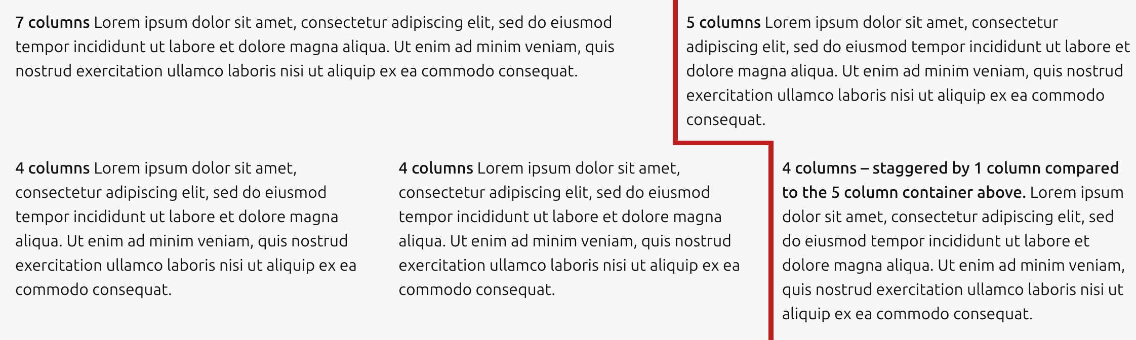
This happens every time containers with large blocks of copy in adjacent rows differ by one column - e.g. 5 followed by 6, 7 followed by 8, etc.
To remedy the “off by one column” problem, we use a system inspired by an oct-tree: Widths are multiples of 25% of the available space. This simple rule decimates the available choices, which has the following beneficial effects on our layouts:
Before we look at examples, let's highlight a couple of considerations used in conjunction with the 25% rule:
The 50/50 split is a very versatile layout. It places a short scannable part of the content (usually a heading) on the left-hand side. The rest of the content goes into the right-hand side. A few of the benefits of this layout:
This layout is designed with two things in mind: the average time visitors spend on a brochure page (between 20sec - 1:35min), and the long length of our pages.
For example, if you only give us 20sec of your time on a page that takes 5min to read top to bottom, our best chance of directing you to the part of the page you are interested in is to let you scan by headings - which you can do on most pages in under 20 sec. Then, only when you’ve found the part you came for, you move over to the right, read the dense copy and hopefully click on a CTA.

A variation of the 50/50 split, we subdivide one of the halves further to obtain a 25/25/50 layout.

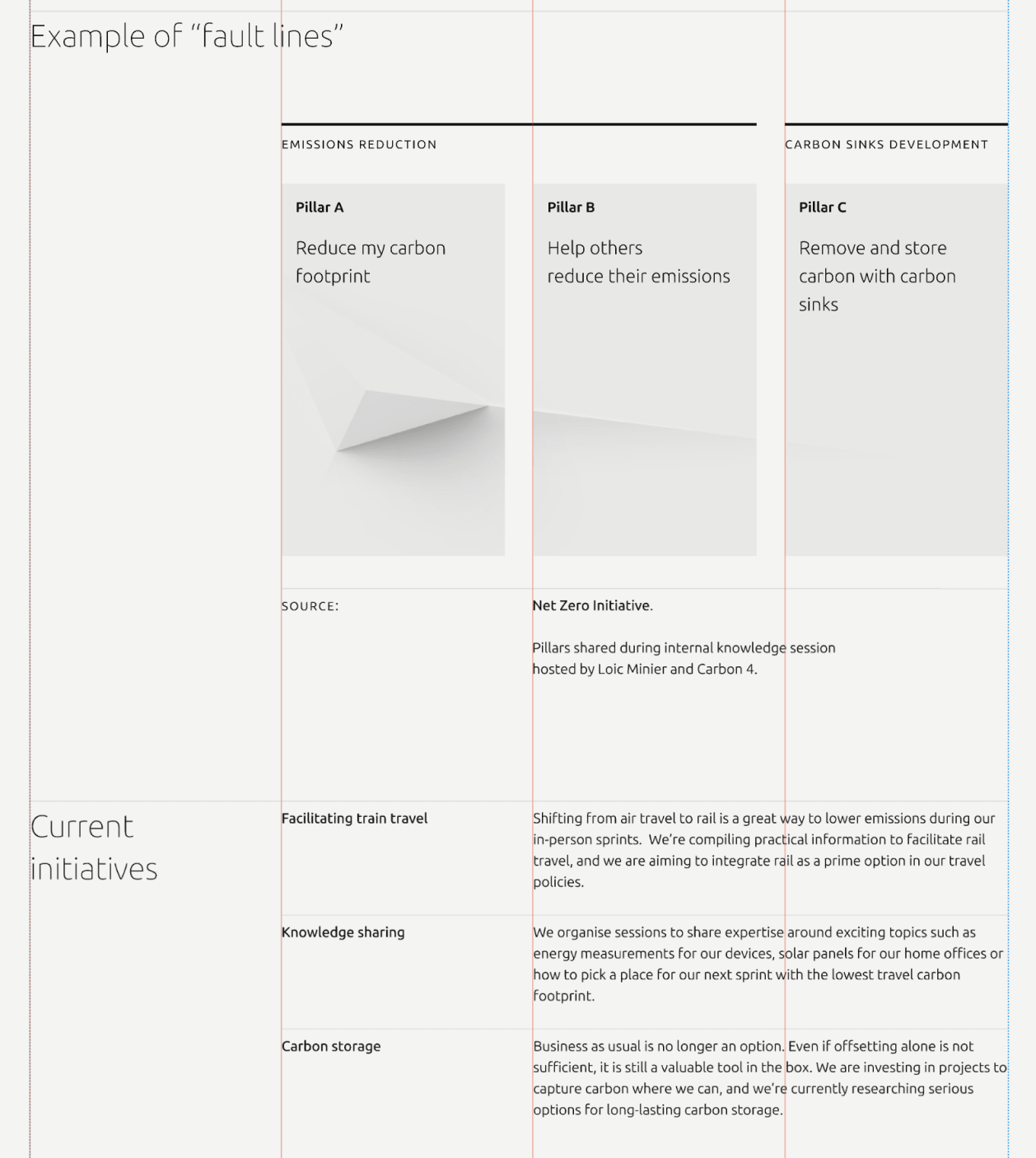
The 25/75 split reserves 3 columns for small headings (or just “structural” white space) and a larger, 9-column area that can be used for long copy - or further subdivided into multiples of 25%.
The simplest case: wayfinding heading + long h2 heading and some content: