Vanilla 4.0 doesn’t introduce any breaking changes on SCSS code level, or in terms of removed components. It is still a major version update because it introduces new heading typography and increases the grid width. These changes may lead to visual differences and bugs.
This migration guide explains what changes are introduced in Vanilla 4.0 and how to QA them in your projects.
Vanilla 4.0 is an interim release that keeps support of old (v3) style of components, and will introduce elements of new branding and components in the new style, deprecating any unnecessary old components on the way. Some of the new components have already been added, and the reminder about them is included in this guide as well.
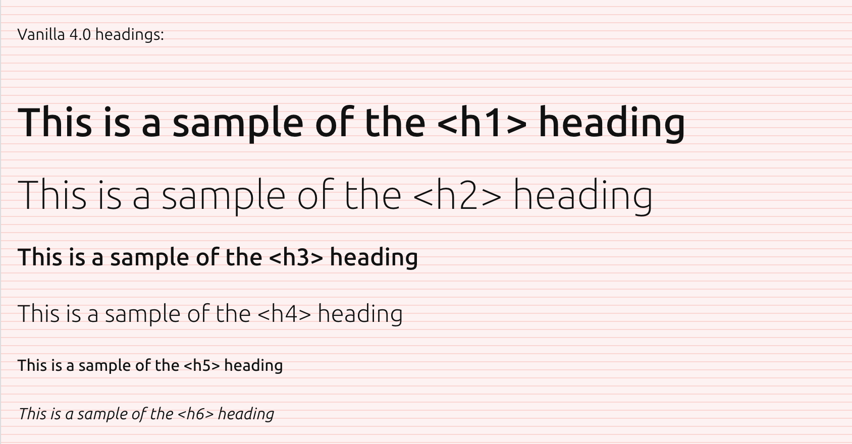
Vanilla 4.0 introduces updated heading styles that are built on fewer font-sizes. We also introduce the new variable Ubuntu font.
Headings level 1 and 2 are using the same font size (2.5rem) with heading level 1 being bold. This means headings 1 are now using smaller font size than in Vanilla v3, but are bold, while headings level 2 are larger than before.
Similarly headings level 3 and 4 use the same font size (1.5rem) with level 3 being bold. Making level 3 use smaller than v3, but bold, and headings level 4 larger.
Headings level 5 and 6 don’t change. They still use the same font size as default text (1rem), with level 5 being bold, and level 6 using italics.
Typography styles are built into the base styles of Vanilla and shouldn’t require any code updates. But, because this is a change that may affect the look of the website or UI make sure to QA any pages or templates that may be affected by the updated heading sizes.
If you have any custom styles or components built on top of Vanilla headings, or using Vanilla headings, also make sure that they work and look correctly.
You can search your codebase for any names listed below to find places that may be affected:
h1, h2, h3, h4, (h5, h6 if you want to be thorough)
p-heading--1, p-heading--2, p-heading--3, p-heading--4, (optionally p-heading--5, p-heading--6)
%vf-heading-1, %vf-heading-2, %vf-heading-3, %vf-heading-4, (optionally %vf-heading-5 %vf-heading-6)
Alongside the typography changes width of the grid (max width of the page) has been adjusted as well by increasing the value of $grid-max-width variable from 72rem to 80rem.
This change is automatic and doesn’t require any migration unless you have overridden the $grid-max-width value yourself.
Search your codebase for $grid-max-width:
Because this change affects the look of the website, make sure you test your templates to see if there are any issues caused by width change.
Some issues that may happen include:
Images (for example in cards) that have a fixed width based on previous card size, this is especially true when using our image tag template that serves optimised images through Cloudinary.

Old versions of global-nav have a setting for max width that may need to be adjusted.

Please make sure to review any templates or components that may make assumptions based on page width.
Vanilla 4.0 changes the default text colour to black #000 (from previous #111). This change is automatic and doesn’t require any migration.
If you have used the previous text colour (either by its value #111 or by variable name $color-dark) in any custom styles or components, make sure to update them to use the new colour.
In Vanilla 4.0 we have updated some of the dark theme colours to be more accessible. This change is automatic and doesn’t require any migration.
If you are using the dark strip (.p-strip--dark) make sure to test them to see if they still work well with the new colours.
In Vanilla 4.0 we introduced a new link style for links on dark background. Instead of using the default link colour or existing inverted link, new class is-dark should be added to text links that are placed on dark background. The inverted link p-link--inverted should be used only for links on backgrounds of unknown dark colour or on top of images.
Vanilla 4.0 introduces a new page background used on the brochure sites. It can be applied by adding the is-paper class to the body element.
New pages on brochure sites should use this new background colour by default.
When using the paper background, or updating an existing page to it, make sure all content and components work well on top of the new colour.
Some issues that may be caused by paper background: Updating old pages might require sweeping the site for images with embedded white backgrounds, and updating them to be transparent. Components that assume white background may need to be updated. Hover effects and active states that assume white background
To highlight sections of the page you can use a new white strip p-strip--white, which will create a strip with white background.
For more information see our documentation of paper background , white strip component or brochure layout guidelines.
In Vanilla 4.0 we clean up some of the colours used in the design system and introduce a new accent colour. The brand colour in $color-brand variable is updated to the Ubuntu orange value #E95420 (from previous "brandless" #333). We also update the $color-accent variable to a new teal colour value #0F95A1.
Default brand colour is also reflected in old Suru backgrounds, which are now using Ubuntu orange instead of the previous dark grey. Please note that old style of Suru is deprecated and should not be used in new designs.
This change is automatic and doesn’t require any migration unless you have overridden the $color-brand or $color-accent values yourself. You should remove any overrides and use the new values if possible. If you are using these variables anywhere make sure that relevant styles still work with the new values.
If you are using the $color-brand or $color-accent variable in any custom styles or components, make sure to verify they work as expected and review them with visual designer to make sure the new colours are used correctly.
If you are using the old Suru strips (.p-strip--suru or .p-strup--suru-topped) make sure to test them to see if they still work well with the new colours. If you were depending on them using the old dark grey, you can revert to that by chaning the value of $color-suru-middle variable to #333.
In Vanilla 4.0 we remove rounded corners from all components. This change is automatic and doesn’t require any migration.
The $border-radius variable still exists, but it’s value is now 0 and it’s deprecated. It will be removed in the future.
If you are using the rounded corners in any custom styles or components, make sure to remove them.
In Vanilla 4.2 we updated the style of logo section component to allow using logos of variable width. This introduced a breaking change for some of the old logo sections that were using images not aligned by design team.
If you have logos that are not aligned properly, you can use the .has-misaligned-images class as a workaround to apply some basic styling to them, before you replace images with correctly spaced.
For more information see the logo section component documentation.
Before releasing Vanilla 4.0 we started adding new components to help building brochure sites in a new style. While these are not technically new to 4.0, it’s worth taking the migration opportunity and learning more about them, and start using them where feasible.
Section components are containers that provide spacing between sections and subsections of content on brochure site pages.
In many cases new section components can replace existing strips (especially the ones that needed to have u-no-padding--top applied). Shallow and deep sections allow to adjust spacing as needed.
For more information see the section component documentation or brochure layout guidelines.
New rule component provides a consistent way of adding horizontal lines that are a common element of the new style.
Use the new component in places where previously an hr with u-no-margin--bottom class name was used.
To use rule component on dark backgrounds use the is-dark modifier class.
For more information see the rule component documentation or brochure layout guidelines.
New style of brochure sites it based on 25% (on the desktop breakpoint) splits of the grid. While such layouts can be built with our existing 12 column grid, we now also provide the most common grid splits (such as 50/50, or 25/75) that should make building the pages in a new style simpler and more consistent.
For more information see the grid documentation or brochure layout guidelines.
White strip was introduced in Vanilla 4.0 as a way to highlight sections on top of a new paper background. See “Paper background” section above for more information.