Vanilla uses three main breakpoints for screen sizes, below you can see the setting, default width and device examples at which the content will scale.
| Setting | Default value | Device example |
|---|---|---|
$breakpoint-x-small |
460px |
Mobile (portrait) |
$breakpoint-small |
620px |
Mobile or tablet |
$breakpoint-large |
1036px |
Desktop |
$breakpoint-x-large |
1681px |
Large desktop |
$breakpoint-navigation-threshold |
$breakpoint-large |
Desktop |
$breakpoint-heading-threshold |
$breakpoint-large |
Desktop |
@media screen and (width < $breakpoint-small) {
  // css
}
@media screen and ($breakpoint-small <= width < $breakpoint-large) {
  // css
}
@media screen and ($breakpoint-large <= width) {
  //css
}
@media screen and ($breakpoint-x-large <= width) {
  //css
}
The $breakpoint-navigation-threshold is the breakpoint in which the navigation switches from horizontal (desktop devices) navigation to a burger style menu (mobile devices).
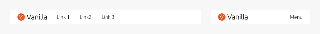
If you have a large number of menu items, you may consider overriding this value to a larger value so the navigation snaps to a burger menu at a larger breakpoint.
$breakpoint-heading-threshold is the breakpoint in which the heading sizes switch from a 1:2 modular scale ratio (desktop devices) to a 2:3 ratio (mobile devices).