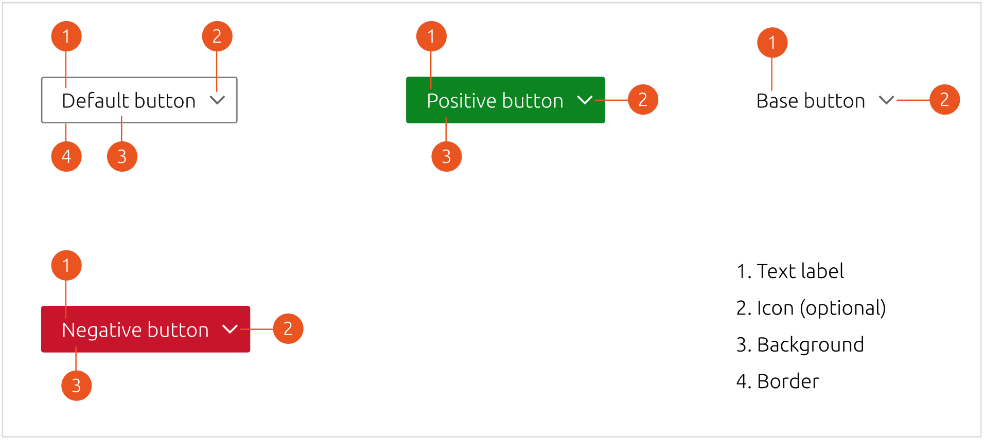
Buttons are clickable elements used to perform actions.
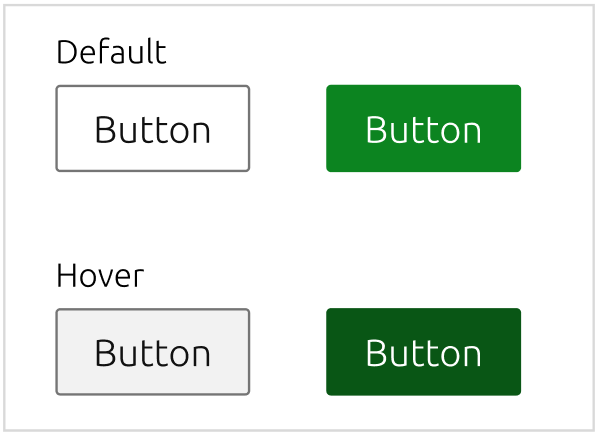
On hover, the button background will look slightly darker to signal the user that the action is enabled.
On click, the button will perform the enunciated action.
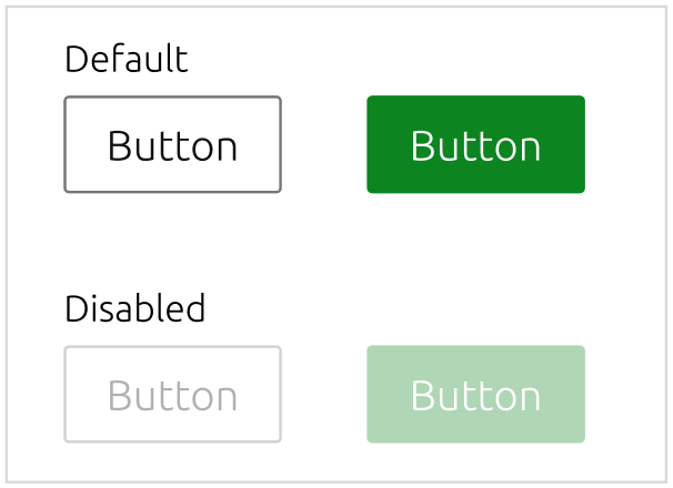
When the button is disabled, it will have a transparency of 50%. The cursor won’t change when the user hovers the button.
When a process is being carried out in the background, to indicate progress a spinning icon will replace the text of the button.

Buttons can be used in 3 sizes:
This is the size most commonly used when vertical space is not a concern.
Use this size to place a button after a line of inline text, as a CTA for example.

To use in contexts where vertical space is limited, this size reduces the vertical padding.

If you are working with small text and need a suitably sized button, this size combines a small font size with a tighter padding.

| Variant | Description |
|---|---|
| Default | Indicates a positive action that isn't necessarily the main call-to-action |
| Base | Can be used to discreetly indicate a secondary action |
| Positive | Indicates a positive action that is the main call-to-action |
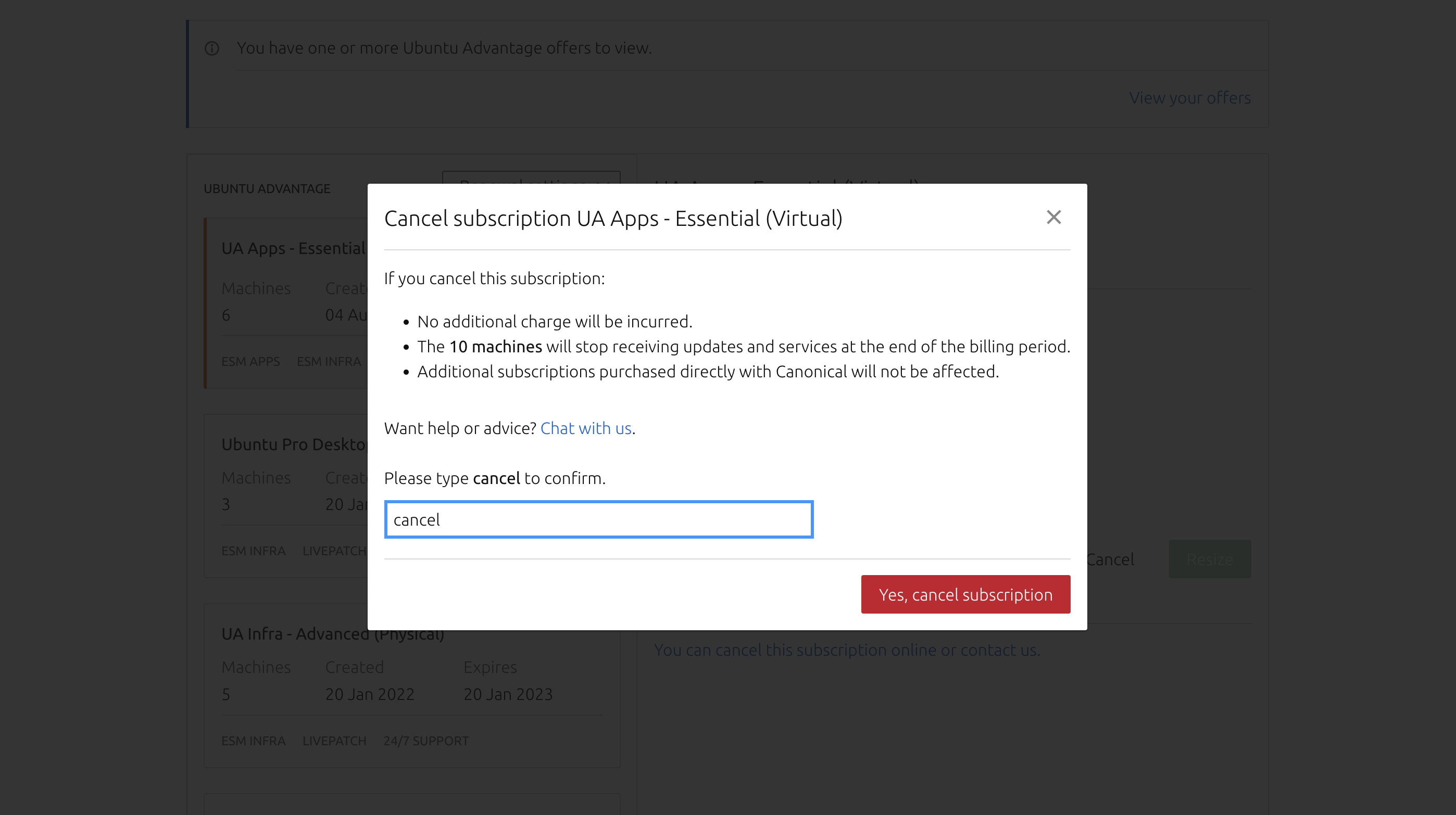
| Negative | Indicates a negative action that is destructive or permanent |
| Brand | Can be used with the main colour of your brand |

A default button can be used to indicate a positive action that isn't necessarily the main call-to-action. Can be used in isolation or alongside a primary button.


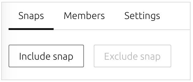

A base button can be used to discreetly indicate an action with less emphasis. It is often used alongside a default button.


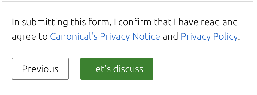
A positive button can be used to indicate a positive action that is the main call-to-action.



A negative button can be used to indicate a negative action that is destructive or permanent.
